London Lions Rebrand - A New Era Begins
The London Lions are entering a new chapter - one built on bold ambition, global relevance, and deep roots in the city we represent. Our rebrand is more than a change of look. It’s a statement of intent. A visual and cultural identity that reflects who we are now, and where we’re going next.As the club continues to grow both on and off the court - from competing on the European stage in the EuroCup to building toward a new 10,000+ seat home arena - it became clear that our identity needed to evolve. We needed a brand that could stand tall within London, represent British basketball with pride, and speak confidently to a wider global audience.This rebrand brings clarity, strength, and purpose to our visual language. It’s designed to feel unapologetically modern while staying rooted in the heritage of the club.
Design Language
Every element of the new identity has been carefully considered:
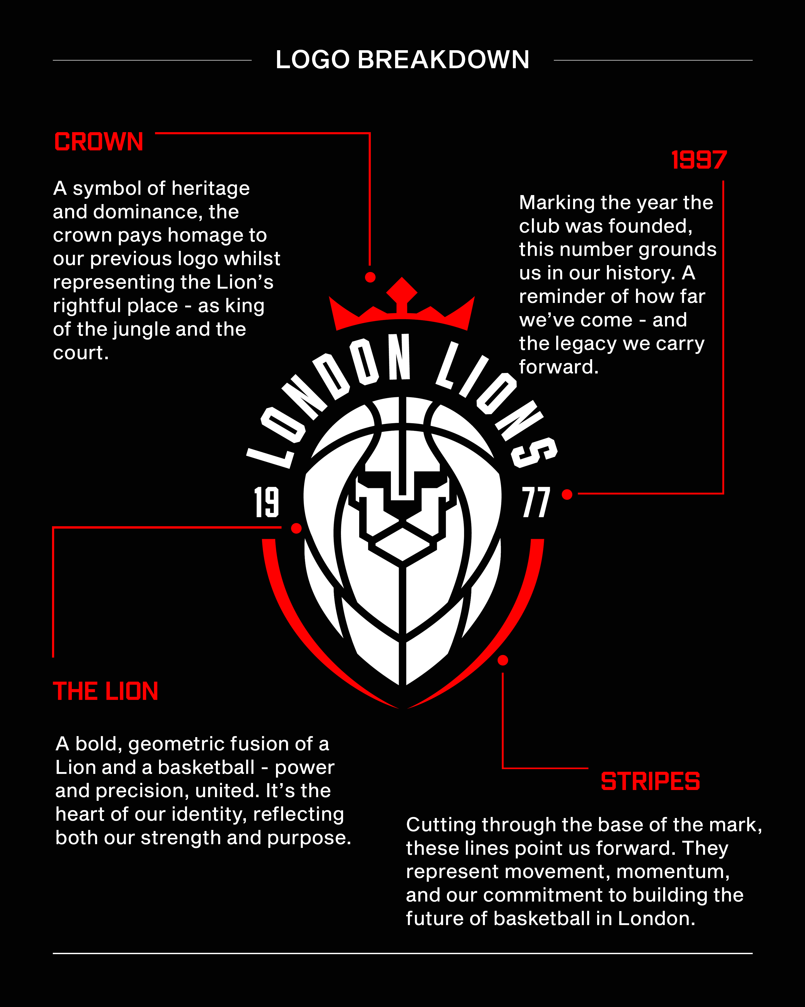
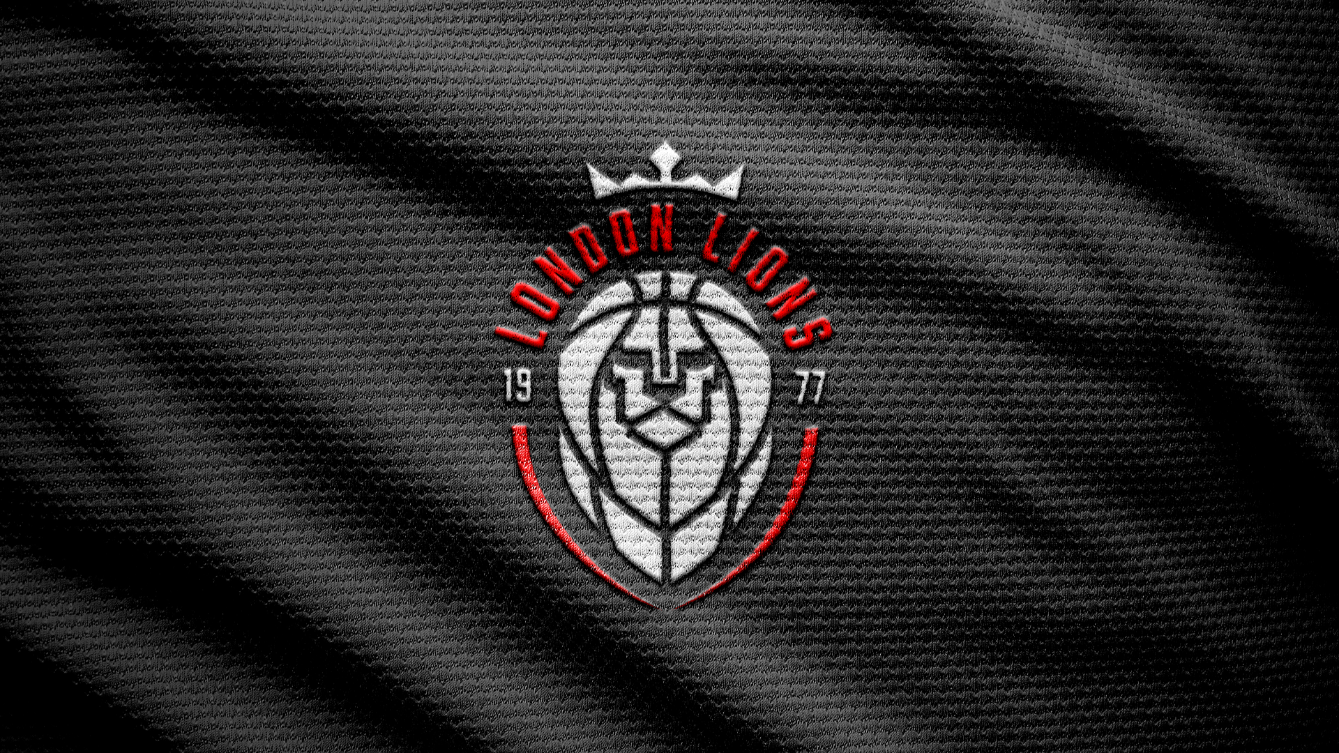
The Crown sits proudly atop the logo - a direct homage to our previous mark, and a lasting symbol of the Lion’s status as king.
1977 marks the club’s founding - anchoring us in the history of British basketball, while reminding us that our ambition is built on decades of hard work and community.
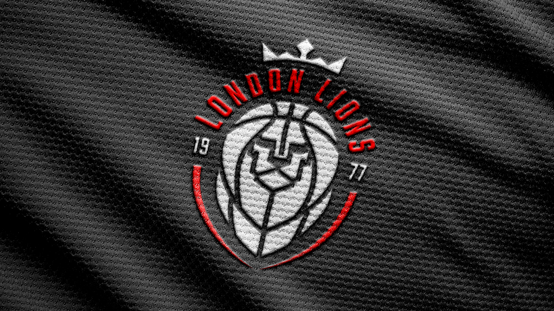
The Lion is a geometric fusion of a lion’s face and a basketball - the perfect union of strength, focus, and identity. Clean lines, forward energy, and a minimalist finish position it for use across formats.
The Stripes cut forward from the base of the logo - representing direction, progression, and our long-term vision. They reflect our commitment to shaping the future of basketball in London, from grassroots to elite.
Gallery
.jpg)